LO2 : understanding communication, skills and knowledge for progression routes
2:1 Critically evaluate a range of communication skills and knowledge required to make application to progression routes within creative media production.
2:2 Use a range of communication skills and knowledge to support own progression goals.
Deadline : Friday 29th May 2020
2:2 Use a range of communication skills and knowledge to support own progression goals.
Deadline : Friday 29th May 2020
Task 1:
look at communication skills need for interviews. How should you conduct yourself, what should you take, what should you wear? How do you prepare for an interview - weather its for university or internship.
look at communication skills need for interviews. How should you conduct yourself, what should you take, what should you wear? How do you prepare for an interview - weather its for university or internship.
what communication skills do you need for an interview ?
- non- verbal communication
you need to make sure that you are able to communicate well both verbally and non verbally, the way you can do this is making sure whilst at an interview that you are remaining good eye contact to your panel and that you are doing in a way that makes you look confident and professional. It is also a good idea whilst preparing to make sure that your handshake to whoever is he interview is good and professional you can do this by making sure that your handshake is firm and strong, you will be shaking hand at both the beginning of the interview and also the end this is really important when having an interview as it makes you look important. Lastly body language you need to make sure that you remain a good posture and body language for example is you are sitting in an interview slumped and although you are bored, you will look lazy and as though you don't want. the job. But if you kept a straight posture though the interview you will look more professional and therefore be more appealing to the people that are hiring you.
- Listening
Whilst at the interview it is probable that the employer may ask you questions about yourself and why you would be right for this job it is really important you listen to these questions because if you answered a question incorrectly or asked the employer to repeat the question firstly it would make you look as though you rant paying attention and your not interested this would be unappealing to an employer, it would also give the rest of the interview and award feeling.
- friendliness and respect
these are very important when having an interview because if you appear friendly to the company there is a wider chance that they will employ you because they have the reassurance that you would bring a positive view to the company and you would be friendly around the other members of staff and this is something that is important to an employer so it is important that at the interview you show this about yourself that this gives the employer a idea of yourself. Its really important to show respect at an interview because this will make you a lot more appealing to your employer, it also shows that you care and that you are dedicated to the job, you can show this though non-verbal communication.
- being on time
Being on time to an interview may be be the most important aspect of all of this because being on time will prove to your employer that you are reliable and that you would show you onetime for your shift so they can depend on you. If you show up on time to an interview it will also make you look professional and this is important to employers and they want professional people working for them.
What should you bring to an interview ?
- a folder
this will help you carry many piece of paper you may need to but in an professional and organised way, it is probable that at an interview you may need to bring multiple copies of the document so a folder would be an advisable idea.
- Several copies of your CV
It is probable that there may be more than one interviewee at your interview so being several copies will mean that everyone at the panel will have there own CV to look at as the interview is taking place small thoughts like this is appealing to interviewee as they know you are thinking about every aspect of an interview.
- Business card
Although you will have your general information on your CV it is a good idea to have business cards at hand that you can give to your interviewer because this you another way that they can access your personal information when they need to contact you however this is optional.
-A list of questions
This step is important if you know there are questions that you would like to ask your interviewer, this will make you look professional as you have taken time to think about the job and what questions you feel it important to ask your employer you could even wright them down of a pad of paper which you could also bring with you to your interview.
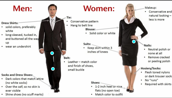
What should you wear ?
- non- verbal communication
you need to make sure that you are able to communicate well both verbally and non verbally, the way you can do this is making sure whilst at an interview that you are remaining good eye contact to your panel and that you are doing in a way that makes you look confident and professional. It is also a good idea whilst preparing to make sure that your handshake to whoever is he interview is good and professional you can do this by making sure that your handshake is firm and strong, you will be shaking hand at both the beginning of the interview and also the end this is really important when having an interview as it makes you look important. Lastly body language you need to make sure that you remain a good posture and body language for example is you are sitting in an interview slumped and although you are bored, you will look lazy and as though you don't want. the job. But if you kept a straight posture though the interview you will look more professional and therefore be more appealing to the people that are hiring you.
- Listening
Whilst at the interview it is probable that the employer may ask you questions about yourself and why you would be right for this job it is really important you listen to these questions because if you answered a question incorrectly or asked the employer to repeat the question firstly it would make you look as though you rant paying attention and your not interested this would be unappealing to an employer, it would also give the rest of the interview and award feeling.
- friendliness and respect
these are very important when having an interview because if you appear friendly to the company there is a wider chance that they will employ you because they have the reassurance that you would bring a positive view to the company and you would be friendly around the other members of staff and this is something that is important to an employer so it is important that at the interview you show this about yourself that this gives the employer a idea of yourself. Its really important to show respect at an interview because this will make you a lot more appealing to your employer, it also shows that you care and that you are dedicated to the job, you can show this though non-verbal communication.
- being on time
Being on time to an interview may be be the most important aspect of all of this because being on time will prove to your employer that you are reliable and that you would show you onetime for your shift so they can depend on you. If you show up on time to an interview it will also make you look professional and this is important to employers and they want professional people working for them.
What should you bring to an interview ?
- a folder
this will help you carry many piece of paper you may need to but in an professional and organised way, it is probable that at an interview you may need to bring multiple copies of the document so a folder would be an advisable idea.
- Several copies of your CV
It is probable that there may be more than one interviewee at your interview so being several copies will mean that everyone at the panel will have there own CV to look at as the interview is taking place small thoughts like this is appealing to interviewee as they know you are thinking about every aspect of an interview.
- Business card
Although you will have your general information on your CV it is a good idea to have business cards at hand that you can give to your interviewer because this you another way that they can access your personal information when they need to contact you however this is optional.
-A list of questions
This step is important if you know there are questions that you would like to ask your interviewer, this will make you look professional as you have taken time to think about the job and what questions you feel it important to ask your employer you could even wright them down of a pad of paper which you could also bring with you to your interview.
What should you wear ?
task 2:
selling yourself
|
portfolios
|
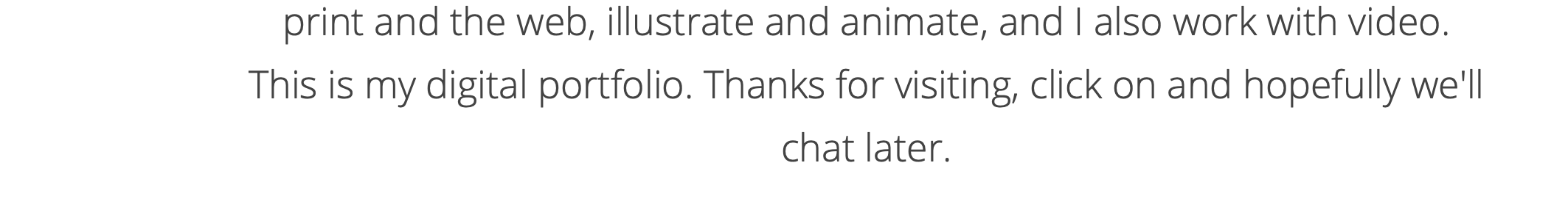
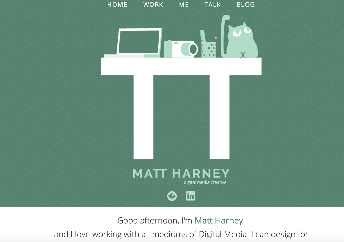
This is Matt Harney is a digital media creator. This is his portfolio/ website. His website is split into 5 different sections Home, work, me, talk and blog. His portfolio is on page and as you press onto each page of the website it pull you down to the certain part of the page. this is his home page, he has chosen a green/ teal colour as the border for the sight which is also a recurring theme thought the site. His logo is the first thing that is shown, he has a desk, laptop, camera and pencil box and cat. I think this symbolises to us what is important to Matt and given us a sense of his favourite things. These objects are drawn is a cartoon way but are also keeping the green look that was previously shown.
|
Matt's name is directly underneath this in a light green/ teal shade this is bold and in capital so it stands out to the audience. directly underneath the words digital media creative as given in the same green colour that was previously shown on his name, however this is much smaller but this is Matt's job title. Underneath these are his social media links this is important on a portfolio as it gives the viewer a direct link to the social media and makes it generally easier for them. Matt has then written as basic introduction, to give the view a basic understanding of what he does. He as written this friendly and in a way it warms the view to Matt as a person. This is brief as it is informative, this is a good idea to have as part of your portfolio as it gives the views a small insight into you as a person.
|
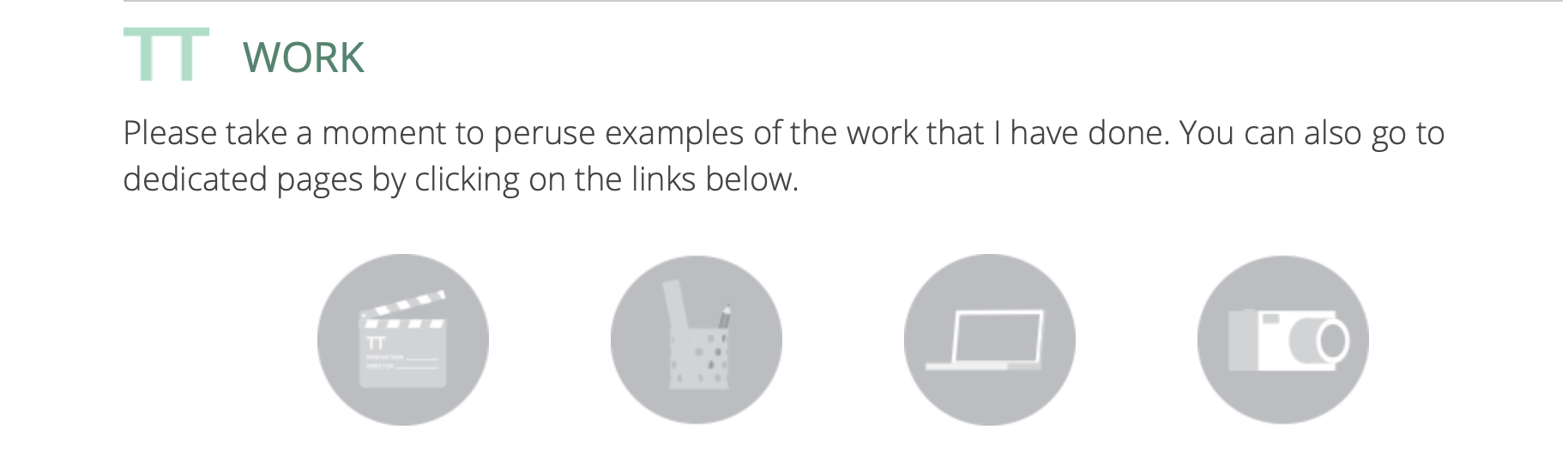
On Matts page then you press on the title work this is what you are presented with, he has stuck with the teal them as the title is work, underneath he has written as snappy sentence asking his views to spend a little time viewing examples of his work. There are four icons underneath these has the same cartoon affect that his front page did. When you hover over each icon they highlight green and once pressed onto they then re-direct you to another page where you are able to explore examples of each of his work.
|
|
|
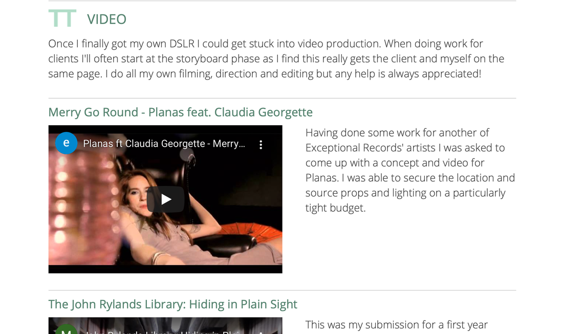
This is one example of one of Matt's link transfers, this is the page that you are linked onto after press the clapper board icon. Matt has used the teal colour as the title and written video in capital letters so it stands out, underneath he has again written a brief description of his work with video making his is short and friendly so it keeps the audiences attention. Underneath this he as written the titles to his work in the teal colour and the names of his videos, he has then places youtube links underneath this for easy access so views can access his work easier next to his video links he has written a brief description about the video, these are again snappy and short to capture the audience attention.
|
|
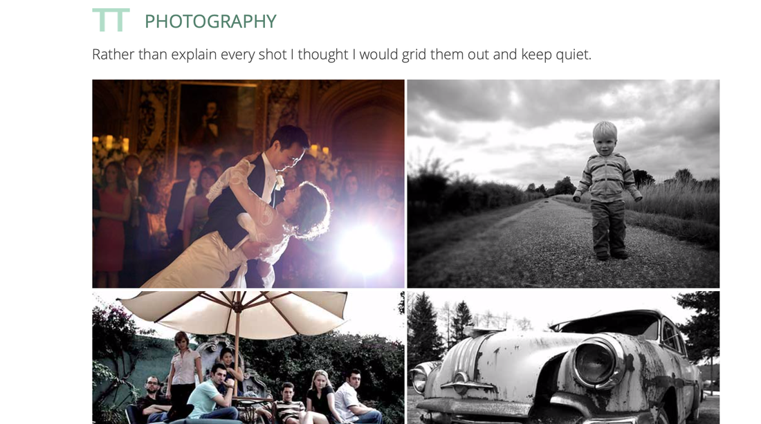
This is the page you are directed onto when you press onto the camera icon on the work page, this page is a little different to the previous icon links as this one doesn't has the YouTube links only a display of images by Matt. Matt has kept his recurring theme with having his title in capitals and in the teal colour. Matt has written a single sentence underneath explaining that he doesn't want to write a paragraph about each photograph he has taken but to let the photographs talk to the viewers I felt like this was really powerful as its doing what a photo should do. Matt has then chosen a range of his best photograph both black and white but also in colour to given the view as insight into his work and his skills in photography. I found this page really powerful.
|
|
|
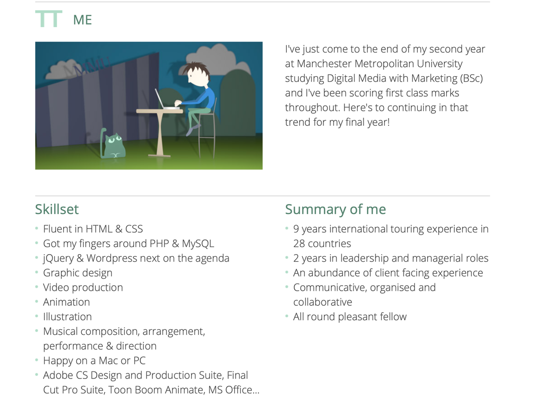
On Matt's website when you press on "me" this is what he are directed to firstly he has used the teal colour for the title which again is in Capitals, underneath he as a cartoon of his working with his cat, he is sitting on a high stool on a desk. The cat cartoon is the same colour and style as it previously was at the top of his page but the cartoon of himself is new and in colour and cartoon style is very simple this might give us a sense that Matt likes things to be simple and crisp. Next to the draw of the cartoon there is a brief paragraph which has become familiar to us through the website, this paragraph gives a quick insight into Matt's education he has kept his short and friendly. Below this Matt has two sections firstly skillset which is in the teal colour and secondly Summary of me, he has then written bullet point underneath each of these titles, bullet point I find are clear and easer to read then a big long paragraph.
|
|
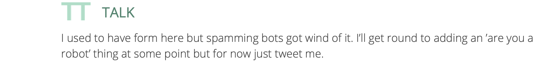
this is the last section to Matt website, he has the title as the teal colour and in capitals and underneath as written a brief paragraph explaining that he will so be adding a system that will mean her will be able to talk to his viewers
|
|
Portfolios
|
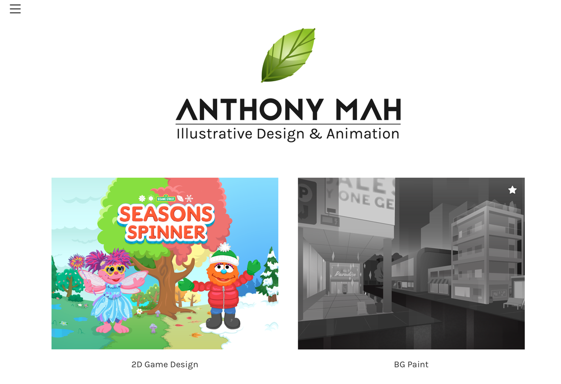
This is the portfolio of Anthony Mah, he is an Illustrative designer and animator. This is his front page and the page you are presented onto when you click onto the page. He has chosen a simple design for his website as it not to over the top, with simple but bold colour. only being used. The border of this page has a cartoon leaf, this my be the item he want people to associate him with. This leaf is cartoon and shiny. Directly underneath this is his name in capital letters in black in a new modern font, this font has removed the line from in-between the "A", I this this is different and modern underneath this is his job title this also stands out and looks professional. The background of his page is white not only does this look professional it also makes everything on the page stand out. more. At the top left hand colour is the 3 bar icon and this represents the menu bar, the menu is split into three different categorises work, about and contact.
|
|
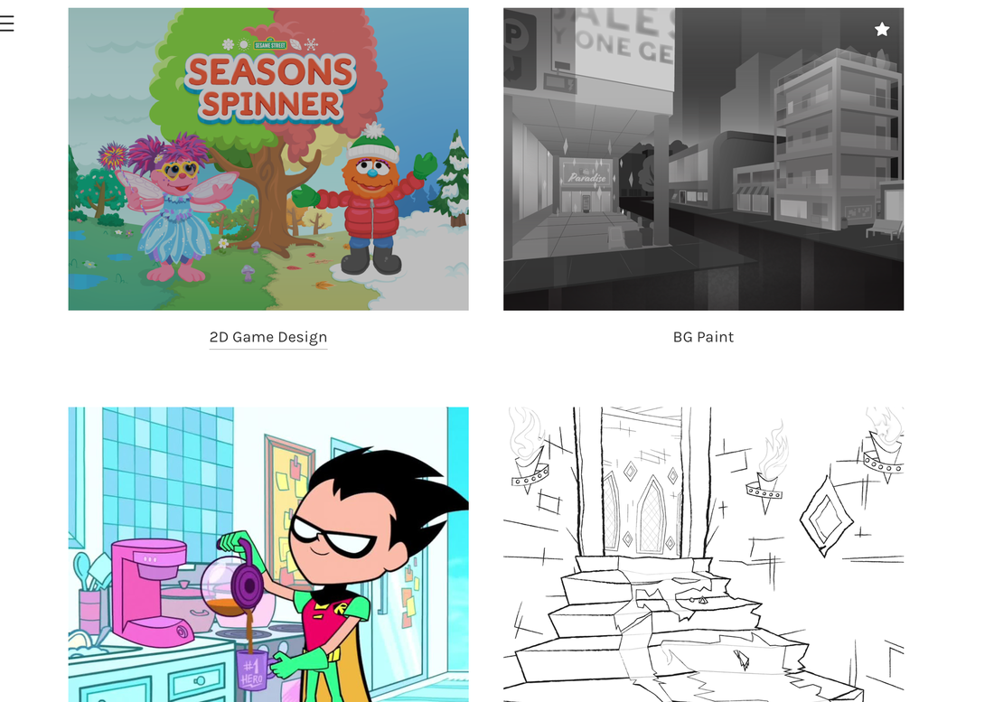
When you press work on the menu or you scroll farther down the page this is the page you are presented with. He has split his work page into three columns off two or six different categories, when you press onto each of the categories you are presented to a video or images witch is related to the picture on the work page. I feel as though this is simplistic but effective and it is easy for a view to look at and to be able to redirect themselves around the website.
these are a few examples of how Anthony has presented his work on each of the different categories. |
|
|
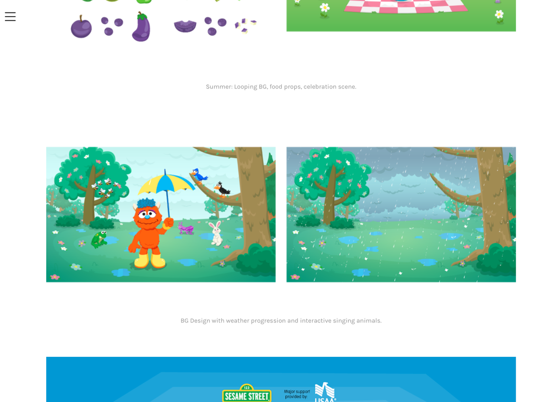
When you click onto 2D game design this is the page you are redirected too on this page he has taken screenshot from the 2D game he designed a game for "Sesame street" for Nick jr food truck festival. He has briefly written a short sentence underneath to wear this screenshot is from he has put this in a faded font and also reduced the size of it. I think he has done this because He want the viewer main focus to be on the screenshot but also for viewer that are most professional they are also able to focus in on the sentence explaining where this screenshot is from. The white background that he has used for his website has really helped these bright and colour images stand out to the audience / viewers. I think white is slick and professional and makes your work look bold.
|
|
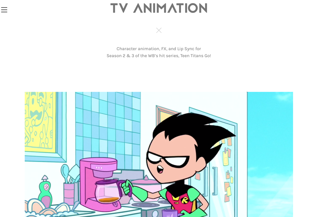
When you press onto TV animation this is the page you are presented onto, At the top of this page is the title so views know they are on the right page, the font of tv animation is the same font that has been used for his name that was on the home page of the website underneath his is the x which in this case is indicating and however this is a newer and more trendy way of same and which might mean he is try to appeal to younger audience. underneath this he has written a brief paragraph about what this is. Below is the video and this is not a youtube redirect link the video will play directly from this page and I really like this feature as it mean your not being redirected and it less work of the viewer that is trying to look at your website. I again think the white background is really making the work stand out.
|
|
|
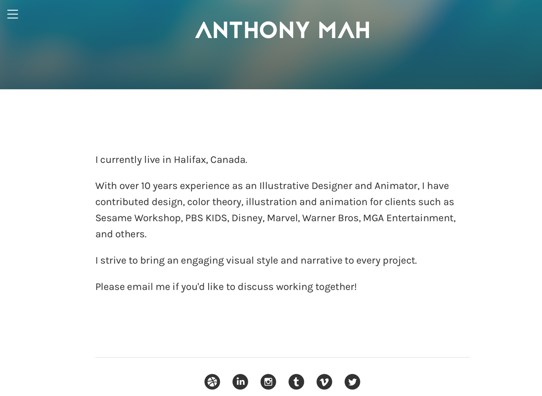
On the menu when you press onto about this is the page you are presented onto, He has used the same font for his name however this time you white for the colour of the font which I haven't seen yet on the website this is behind the border this border is dark blue and dark yellow almost tie dye, however the white font he has chosen really makes the name stand out on this border. Underneath he has written a paragraph explaining himself and a basic introduction to where he's from and companies he has worked with, I feel as though the tone of this is friendly making him for appealing to employees. Underneath this he has put direct links to all his social media account these will redirect you from his page to each of these certain accounts.
|
|
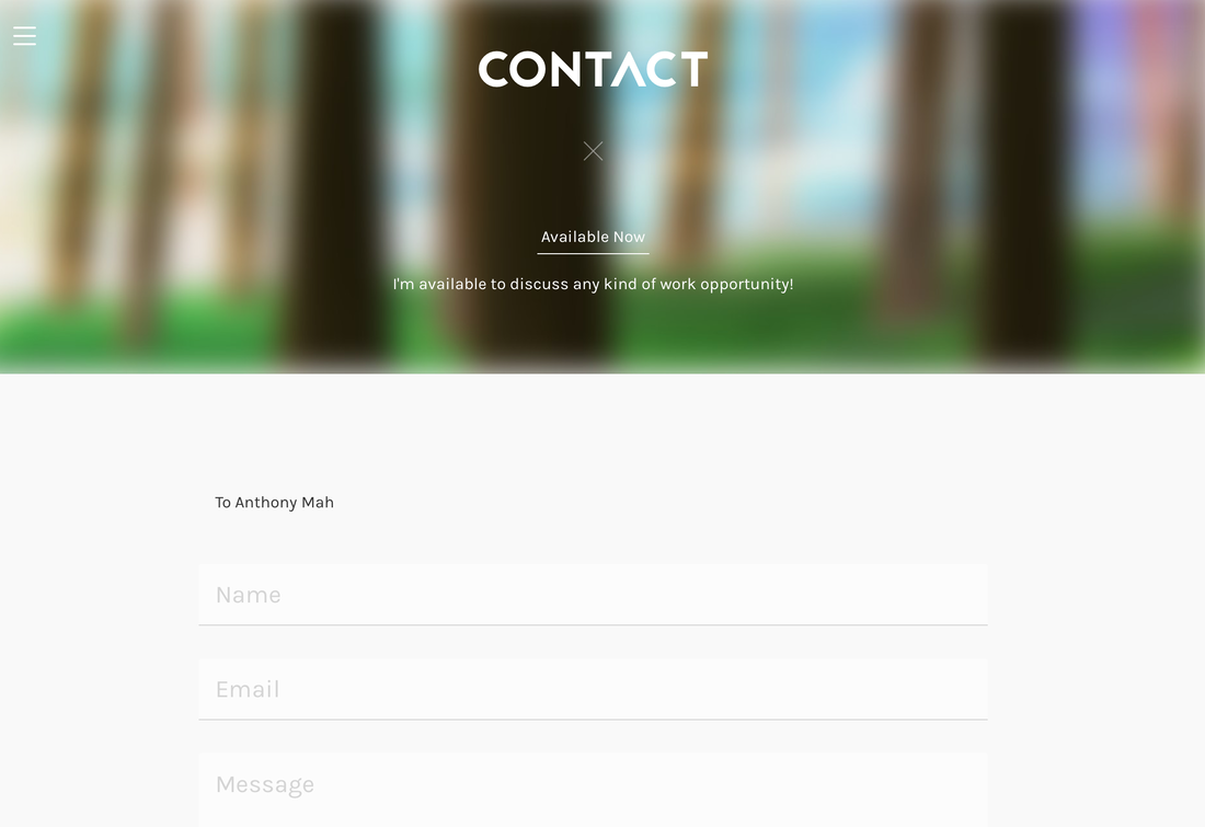
This is the final page on his website "contact" this is where you are able to directly contact Anthony, he has used a different border on this page, this is a possible washed out picture of cartoon trees in front of this is the white title and underneath is the x sign and then it is a snappy sentence saying that he is open to new opportunities. Underneath the border is the template for a message you can send to Anthony. I really like when artist have this on their website because it shows they care about their fans and also they are passionate to kept working to having a wider portfolio of work.
|
|
