LO1.1 Context
propusal
research
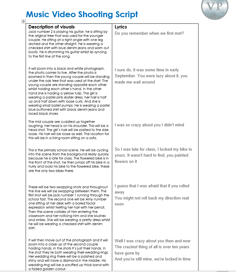
love story - Taylor Swift
Taylor swift " Love story" shows a story which also does Jack Johnson "do you remember" will have. The story is that they had fallen in love in the past or in a previous life and when they see each other they are able to recognise each other again and fall in love In the flashbacks with is similar to the music video I am making do you remember because there will also be flashback of the couple it will swap from modern time to the 20th century.
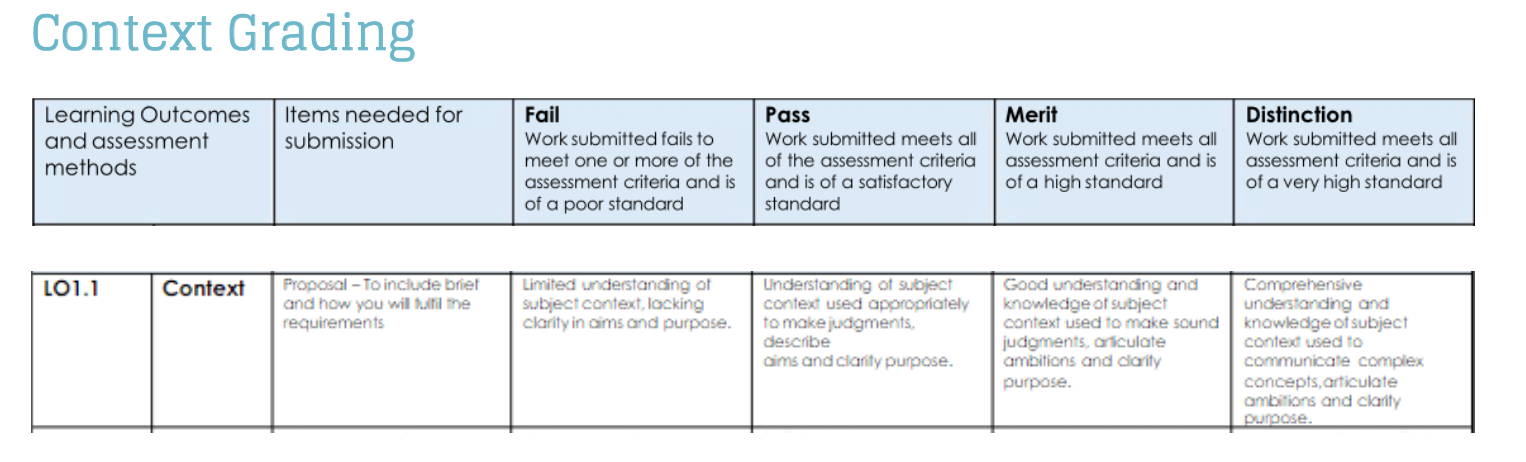
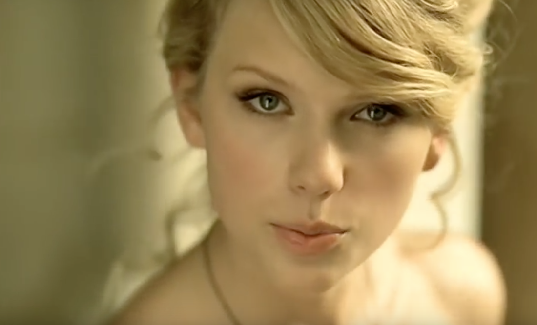
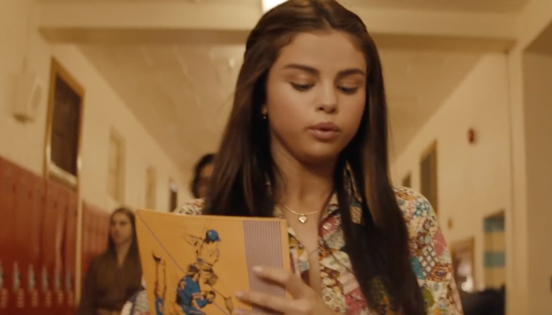
At the beginning of the video we see Taylor walking around the college grounds we are able to tell it is modern day due to the clothes she is wearing she also looks very radiate and glowy this is telling the audience that she will be the love interested in the video. Also the people around her are also wearing modern clothing, the college she is walking around at look very similar to colleges / university in the 21th century. The shots of them are mid shot and long shot of Taylor. The books Taylor is carrying tells us that his is a college\ university and she is a student and he is reading a book this tells us that he is also a student. Because they are at college we are able to tell the couple are aged around 18-24.
|
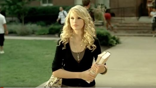
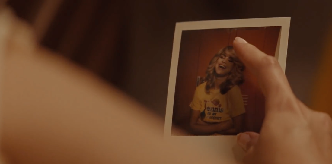
Taylor then looks at the male sitting by the a tree we are able to recognise at this point that he is love interested, he also looks radiate and good looking I think the directors wanted to chose a good looking male love interested to appeal to a larger audience. Both Taylor and the boy looks very simple and Taylor is wearing much make up I think that they wanted to focus on natural beauty and that love should be natural. After Taylor and the boy have looked at each other they remember how each-other are then the flashback happens and then video begins. In the screenshot you are able to see the boy working out who Taylor is.
|
|
|
|
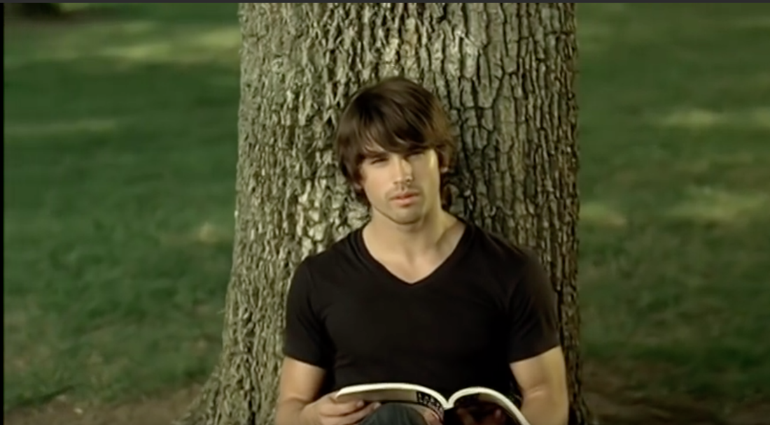
The next scene beginnings and I feel as though this is when the video begins. The scene is shot at a castle the castle has a very old look about it she I feel as though it sets the scene, the lighting once again is very natural and they camera angle is showing Taylor left to the screen. Taylor is very and old 1800s dress with a corset her hair is done up to make her look elegant and the colour her dress it cream, in the 1800s she would have been though of as rich she might even be a princess hence the castle but despite the dress and the jewerly she isn't wearing much making and still looks natural. Thought the video it keeps going back to the shot of Taylor at the castle although there are different camera shot each time there are different camera shot this make the video more interesting for the audience to watch also it gives the video a very dreamy feeling
|
The camera shot continually changes in the shoots she is in the castle, I really like the fact. that the video through and through is natural and it is constanlty giving the audience that same message. The camera shot in the screen is a close up also the camera is tilled Taylors shoulders and blurred and her face is focused, this is showing Taylor looking very elegant again, the background of this shot is cream is it blends in very to the background making us once again focus on Taylors face.
|
|
|
|
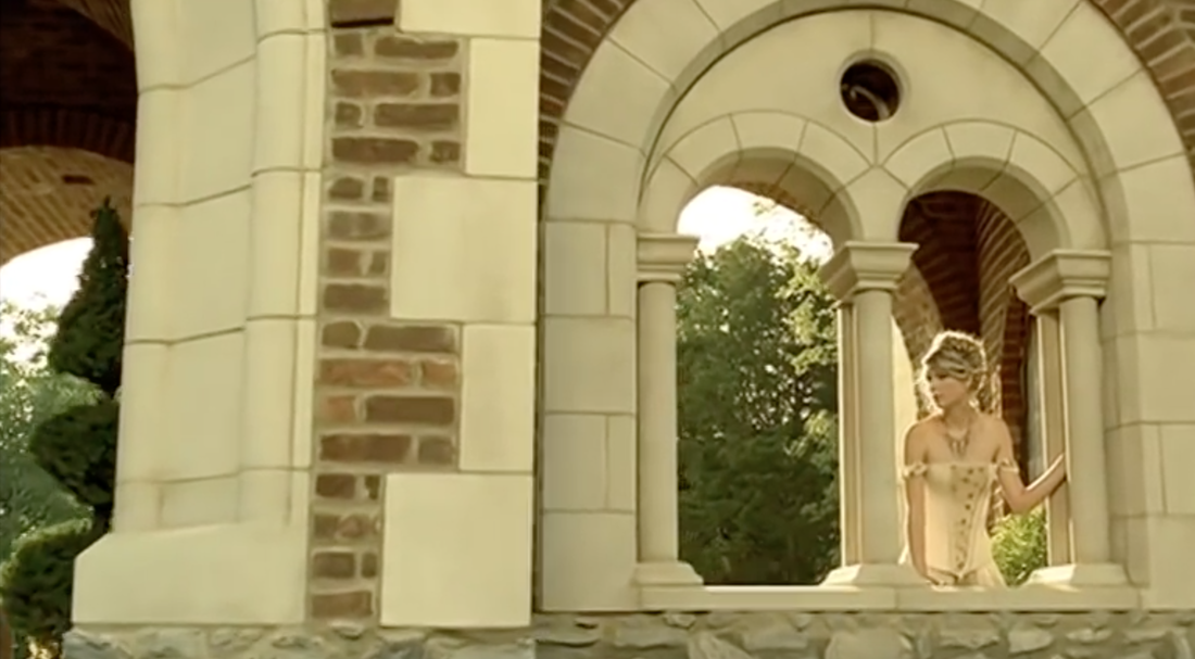
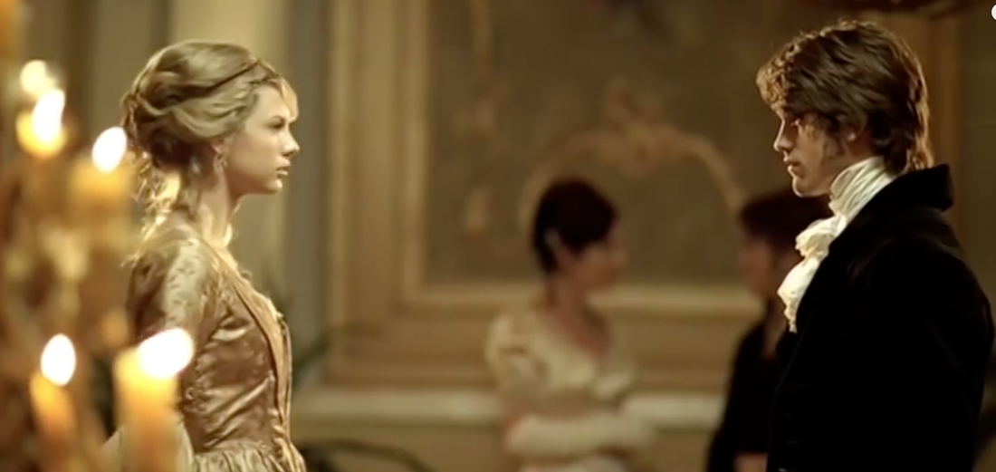
We now see Taylor swift and the boy at a grand party with the male love interested, in the 1800s century you would have had to have been rich to have gone to a party like this you would have also of had to have a high social class. You are able to tell this is a grand party due to the location, the location is very grand it has beautiful paintings on the walls the colours are also very grand and party but the room is was shot in is very large also the floor is a shiny and wooden. There are a number of different shot types in the ballroom mid-shot , close up and wide shots. The way the characters are dressed in scene is very grand they are all wearing beautiful ball gowns and gloves and their hair is done up very elegantly the props in this scene is a candle chandelier there are many of these through these scenes. In this particular shot the couple are meeting for the first time and they are falling in love.
|
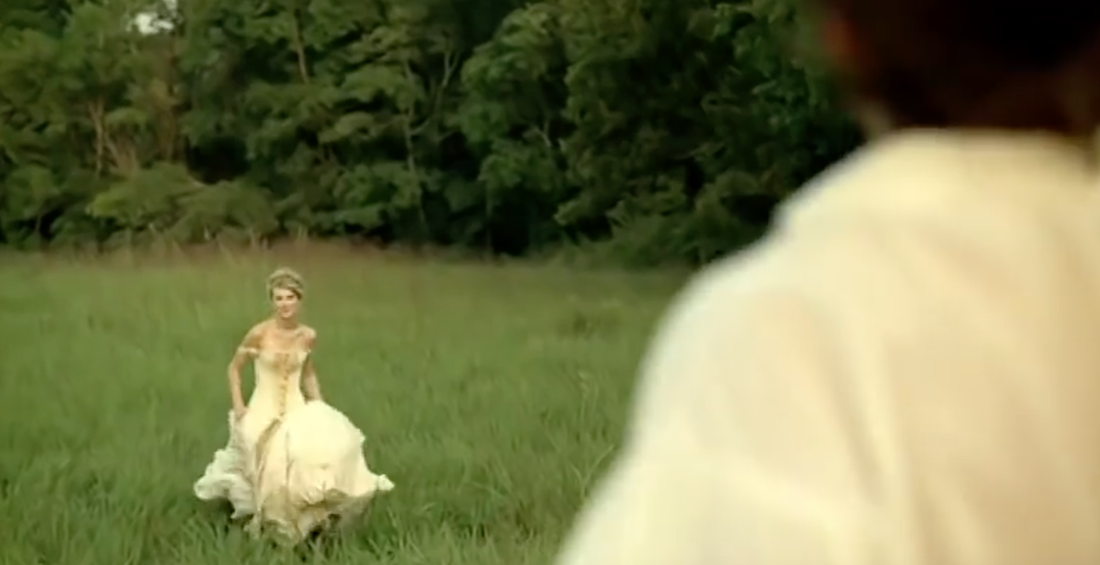
One of the final shots is in a field, overall after watching the whole video the story they are trying to tell is the story of Romeo and Juliet, because they meet at a ball and fall in love this could have possibly been happening in the same time period. I think that a field was chosen for this location because it is far away from there reality and it although they are escaping to be with each other because there is something stopping them from being together so they run away because the love they have for each other is true. The shots used in. this scene is a long shot the camera is placed behind the male back but we are able to see Taylor in the distance they are wearing the same clothes as she does at the castle in the previous scene if is showing her running away, this scene is very natural once just like the other ones,
|
bad lier by Selena Gomez
this video has a twist but is also a story about lust through the whole video we think she is in love with the male but she is actually in love with the female the video gives the effect to make us think it was in the 80s due to the look of the video.
|
|
|
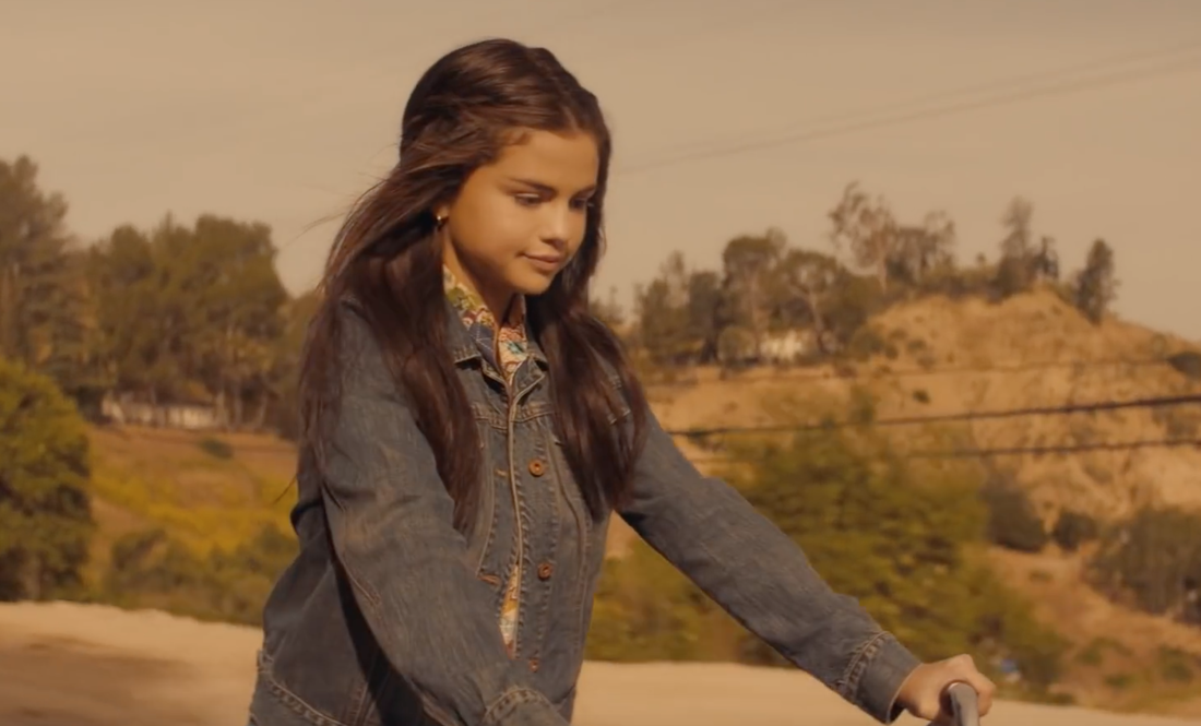
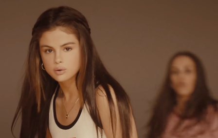
this is one of the first shot of Selena in the music video is riding on a bike in American hills she is looking content and looking happy, she is wearing a denim jacket and a flowery blouse, her done up half up half down she looks very pretty, there is a colour tone to make the video look although it was shot in the 80s. I think we are able to recognise she is love interested. as she is already the focus of the video so earlier on. The lighting for this scene is very natural and the light is sunrise. The shot in this shot is a mid shot. her bike looks although it was from the 80s as it is an old bike and not like new modern bikes
|
Now Selena is at an American high school there are old posters around indicating this is an 80s American high school, I think they chose this location to show the age of Selena in video, in this screen Selena is being singled out as being different as the other student as the high school are looking at her in a bad way. In this shot this is a close up her face to show her facial expression and that she is feeling upset that she is being singled out she is holding old school books this is another indication that she is a school student. The light is think shot is a ceiling light, this light is quite bright.
|
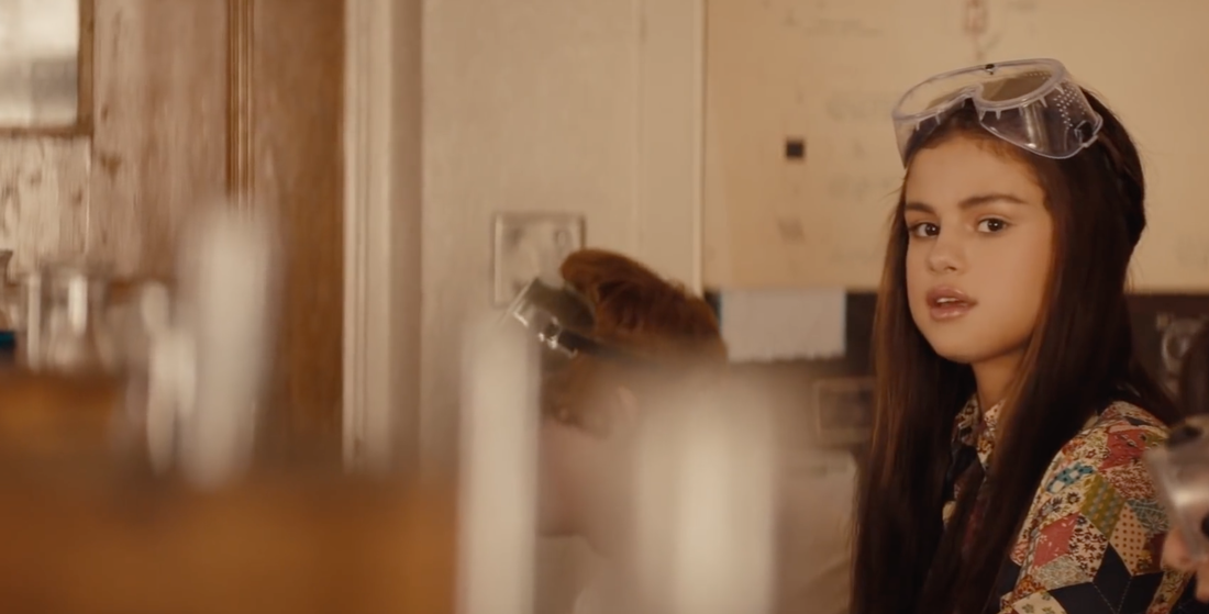
As the music video goes on so does her school day and now she at school in a science class you are a able to indicate this is a science class due to the props in the set the test tube and safety googles there science room she is studying in is from the 80s giving an another indication of the time period of the video, she is wearing the same flowery blouse as she was earlier to show this is the same day as she is wearing the same clothes earlier. she is looking out the window at a man and a women when she looks back in the room her classmate look at her weirdly as the audience we now wonder if the love interest is the man. The lighting is natural in the only light source in the room is coming from the window.
|
this shot is later on in the video she is playing sports in the school and the women that she was previously looking at in the video appears as PE coach she keeps looking over at her and smiling. Her costume is finally different in this shot as she is wearing her sports kit the sports kit is very America vest top and shorts. The lighting in this scene is very natural once again the light source is coming from the high windows, in this scene there is a variety of shot of but in this particular scene it is a mid/close up.
|
|
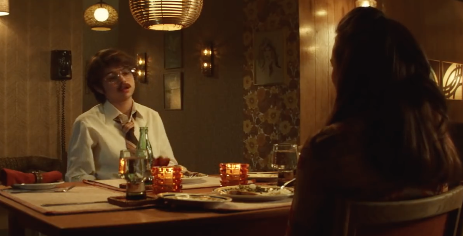
later on in the day / video you can see its near the end of the day and her parent are sitting at the dining room table, however the father is the male that was at the beginning of the video but originally we thought this is who she was crushing on, this leaves the audience feeling confused who is the one she really likes the mother is dolled up is wearing a lot of makeup and it dressed in nice clothing and the father is dressed in what he had previously been dressed in whilst he was at work. there is quite a lot of lighting sources in this room there are many lights hanging and there is also candle light at the table, this room is made to look very 80s and as though it is night, there. is a range of camera shot in this scene including wide shot and mid shot and also close up.
|
One of the last shots of the video is Selena looking a picture of the female sports teacher we now realise that she was the one that she had been lusting over since the beginning, she has kept this a secret as she wanted no-one to know she was gay but it makes sense why she was singled out at the high school. the lighting in this scene is lamp the lighting is dime to show it is night. The picture of the teacher is a plorid that she had been keeping under her pillow, the plorid is very 80s . In this scene she is wearing a night dress this is also indicating it is night once again her bedroom is very 80s themed so is bed.
|
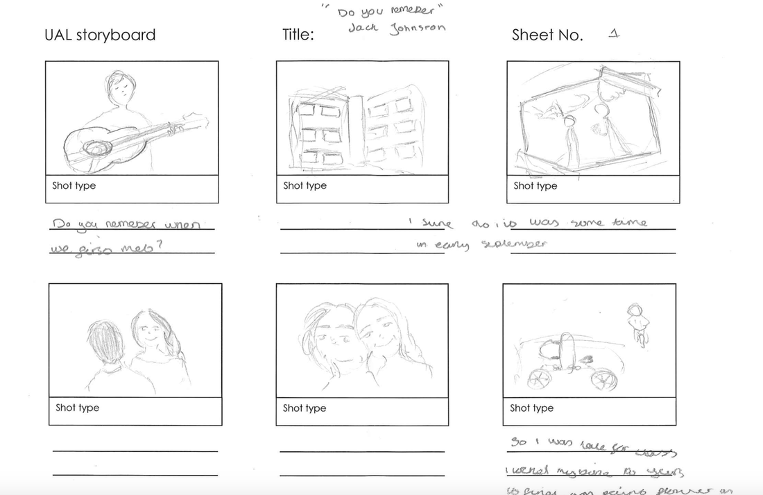
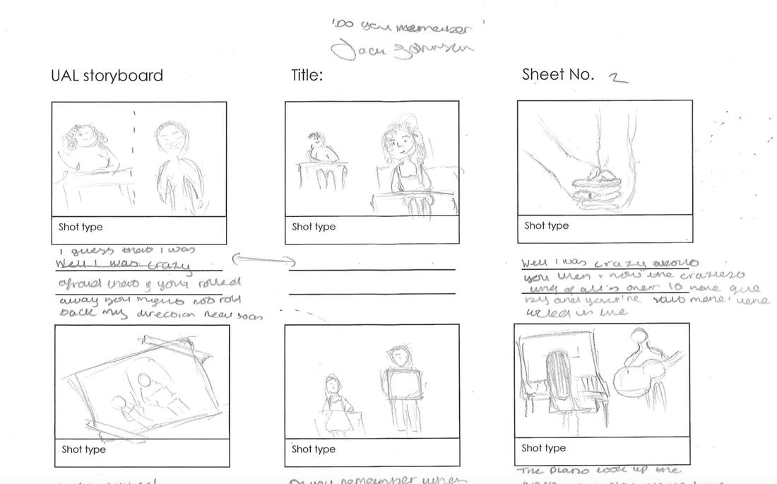
Jack Johnson - Do you remeber
focus group
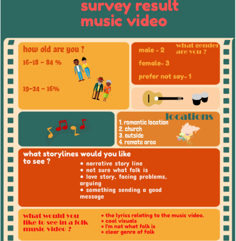
As part of our primary research we made a focus group, so we could find up honestly what they thought about our idea, we started off by telling our focus group are idea and what they thought about it and most importantly weather they liked it nor not, but we also wanted to know what they didn't like about it and it was important to improve our idea if they didn't like it. The whole group agreed they liked our idea, one member of the group thought that the idea sound cool and interesting and thought there could be a-lot of protectional, but when we asked then what they didn't like about it they thought that we might have some issues with the photograph aspect of the video and thought although we might find this diffcult and it could be to ambitious, they thought we might struggle with the transition between the photographs and reality. We now asked the focus group weather they thought the focus group should have a lighthearted ending or weather it should have a darker ending most of the group thought it should have a dark ending with someone dying at the end and that was our original Idea but one member of the group thought the ending should be bitter sweet which the whole group ending up agreeing with. We asked the focus group what they would expect to see in a music video about love and they responded with all the stereotypical idea of love kissing, holding hand etc.
unedited |
edited |
I used the song back to you by Selena Gomez, I used this song as I know it really we'll meaning it was easy to lip sync it and make it look realistic as this something you need to know lip syncing to a song. I felt this important to try as this may be a feature that I use In my actual music video. I Feel this worked successful and looked realistic. the other one we chose to do was lighting as lighting was really important and will be really important in the video, we didn't have much supplies in terms of light so we decided to. flicker a light on and off I like the effect this created, because of the location we filmed it in we were lucky enough to have bright natural day light shining through the window above my head, I really like how it turned out also because of light in shadowed and highlighted my face in parts of the video. I feel the location worked well for the music video and it gave the video a creepy look and feeling.
analysing Website and social media
|
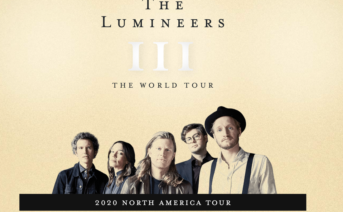
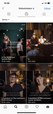
This is the website of the band The the Lumineers, they are a folk band how are most famous for their song " Ho Hey", they are similar to Jack Johnson as they are both folk music, but they both show their band very differently in terms of social media. As you firstly click onto the website this is the first page you are presented with it a tan sugar cookie colour this a very neural background but still gives a strong effect, there is then a cut off picture of the band, I think they have chosen to do this to show how they are and represent themselves as a band. The picture look although it has had a filter put on it so it is able to blend into the neutral background easier, it is a monochrome filter this gives it an old fashion look it doesn't overpower the page, The clothing the band are wearing is quite old-fashioned as a top hat and braces arn't very common anymore, I think this is the look the band what's to give off at the top of screen the is thin elegant and old fashioned writing, the weighting is a serif font the serif font give it a look fashioned look, This looks very strong on the page back not to much at the same time, I think they have chosen this font to make themselves look very professional and crisp. underneath this there is III with means 3th, this is to represent the number of the album, I think they have chosen to represent there number like this as once again they want give the band an old-fashioned look, the font is large and the band definitely to this to be the main feature of the page hence why is so big, the font is white but as a darker shadow at the end, i think this give it a faded, to make it also look natural again. At the very bottom of there page they have a black strip for me personally I think this is the item that standed out the most on page as it is the strongest colour on the page, but at the same it looks elegant as its not to large, inside the black strip there is a the original font but small and it white, not only does it look elegant it contrast well with the black making it stand out strongly. they are adverting the main thing on there page there tour dates
|
|
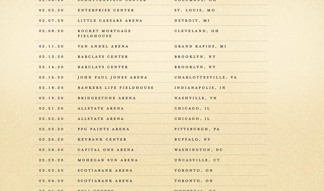
As you scroll down the page more you come across there is the tours date, venues and location, each of these are put onto separate lines with a faint black line behind them. The same colour background is used as previous, I think is because they want to kept the same colour them throughout, they want to kept and elegant look and otherwise it might look to over the top and that's not the image they were going for, the font is the same as it was originally was, my first thought when look at this was it looked very classy and elegant , all the writing is in capital as it previous was it stands out without look to bold. The dates are written in a classic form as they are simple to understand it goes in the format month, day, year this id a very common to write out dates, there is a couple of cm space then the venue, there is then an even larger gap then location. this looks very smart and old fashioned, the extremely light grey is shown underneath the tour dates it show there is space in-between each one, it is faded because they don't want the attention to be taken of the tours date.
|
|
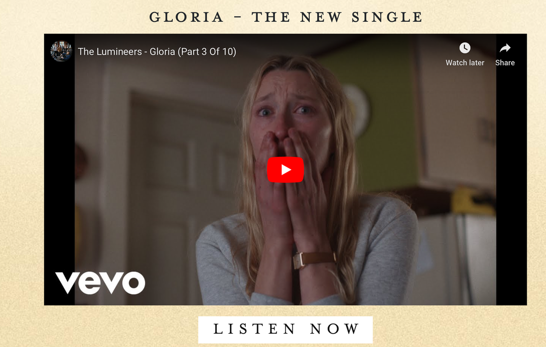
After the tour dates this is the next feature of the page. The background is the same colour as it has thought the website, this is because they want to kept the same theme throughout, at the top of page they are advising there new song "GLORIA", they there is a dash then it says new single, This is in Black as it stands out, the fonts mean bolder and stronger but still looks elegant, underneath is a youtube video picture link, I Think they bond it to be eye catching as you scroll down the page your eyes are drawn to it as it is so large, although doesn't look very elegant it eye catching which they did want otherwise it wouldn't been so large, directly underneath is another link that transfer you to another form of playing there song, it is a white strip and inside black writing, there is the contrast again of the black and white that had originally been shown on the website but this time in reverse white and black not black and white. They are telling the audience to "LISTEN NOW' I felt this seems quite forceful, but it clear at the same time.
|
|
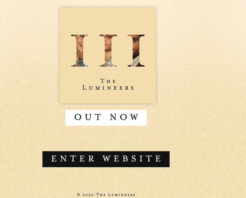
This is the final page of their website, we have the same background that has been there since the beginning to continue with the theme, we then have a picture of there album cover to show the audience what it looks like, it looks very similar to there website theme but the only difference is that the iii is hollowed out and in place are 3 different faces that arn't the band this could be related to contents of the album, this is very different for them as there theme as been an old-fashion and the faces inside the letters don't look old-fashion the glimpse of the faces inside do as they have an old fashioned look to them, underneath it the small thick strip with the thin black writing saying "OUT NOW" this sounds very forceful again but stands out its bold as it previously has been and because of your eyes are drawn to it, underneath we have the black box with the white inside saying enter website this is a link to there official website, underneath in extremely small faint text is a trade make and its official to The Lumineers page and the band.
|
|
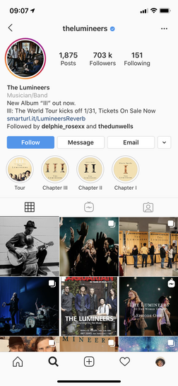
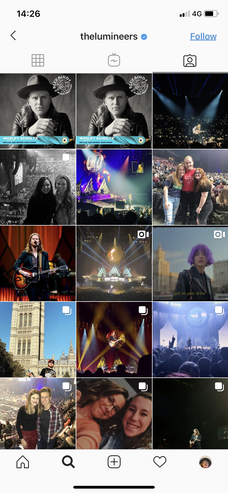
this is the first screenshot of the social media page that comes up, there profile picture is a picture of the whole band dressed in old-fashioned clothing, the picture is very dark apart from the same amount of light coming through the window in the background, I think they chose this as there profile picture as it shows the band as a full group, there name is then put straight underneath the profile picture so Its clear to show who the band are, underneath in faint is what there company/ brand are this is a pretty recent feature on instagram for company to show who they are, they have obviously chosen Musician\ Band, they are then avtising there new album III underneath as they feel this is something important that they want there audience to see, in the next line they are telling there audience that there is a sale underneath for there new tour underneath this would appeal to their audience underneath and would also raise sales as a people what a sale, there is a link to buying tickets underneath this makes it easier for there audience buy tickets as they are able to do it directly from there instagram. Another new feature is that aside from the follow button, there are now message, email and call, the band has chosen follow, message and email this is so they are able to connect with there fans on a more personal level, with bands fans Interaction is really important, without fans bands wouldn't be able to last. Because it's all together it makes it much easier for the fans and band. Underneath they have saved story the band have chosen to save, in this case the bands have chosen to save there previous album stories and there tour story this isn't that recent and been a feature on instagram for a while. this makes it easier for the fans to see the previous stories of the band, the thumb nail for the stories, fit the colour theme they have previous used.
|
|
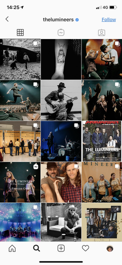
As you scroll down though the first page of their social media there posts come up, I don't think there posts fit a certain theme however there posts have a certain look to them instead its an old-fashioned look, this because they have put a certain colour tone on theme some look bright but faded, some look like sepia and some are in black and white. I think they have chosen this to give there instagram page the same theme as their page and also as it is more interesting for a fan to scroll through as it is eye-catching, without being to over the top. Some of they're posts have a multiple amount of images, this feature is relatively new to instagram so they are doing to have multiple images on some posts but also to kept up with recent themes. Their posts range from picture of them on tour or to general picture of the band or even the band. I think it's good that the band a range of picture to kept it fresh and interesting for their fans. I also go back to the same thing that the band like having a relationship with them. So they have involved there fans in there posts to have at relationship again. it also shows they respect and love their fans. `this is also how they want to represent there band they have decided to do this through there instagram in different aspect. I think the personal picture of the band show that they are normal people and arn't just different people this is another message I think they want to give of to there fans.
|
|
This is a really recent feature of instagram its called instagram TV, instagram TV they are able to have videos on there social media that are longer than 10 minutes, they want to kept up with new trends which is why I think they have deiced to do this have this on their social media page, their videos don't seems to last longer than 5.30, I think this because there fans rant much older than 30 so they don't want them to be to long so they don't lose the audience's attention. There are a range of videos on here such as videos and clips from their world tour, there is also the name of there new album III, this would appeal as this is recent so fans are interested and what to know about their album hence why they made a video about it. They have also made videos with each of there members but separately I think this is so you as a fan are able to get to know the band on a deeper level as get to know each member better as an individuals, these are also questions that fans had asked them, so once again having a relationship and show an interested in there fan, they are making these videos to show there fans they care. These video are shot in the same theme as there band an old effect dark lighting and old fashioned background with simply an old looking light lighting them. I think they chosen this so they can stick with theme of band.
|
|
this is the last page of their instagram, this is their tagged pictures, every instagram page has one this is where, fan or however can tag them in their pictures, this is something the band can't control as they are a public page. By this being a feature you are able to see other people who have similar interest in the band.
|
|
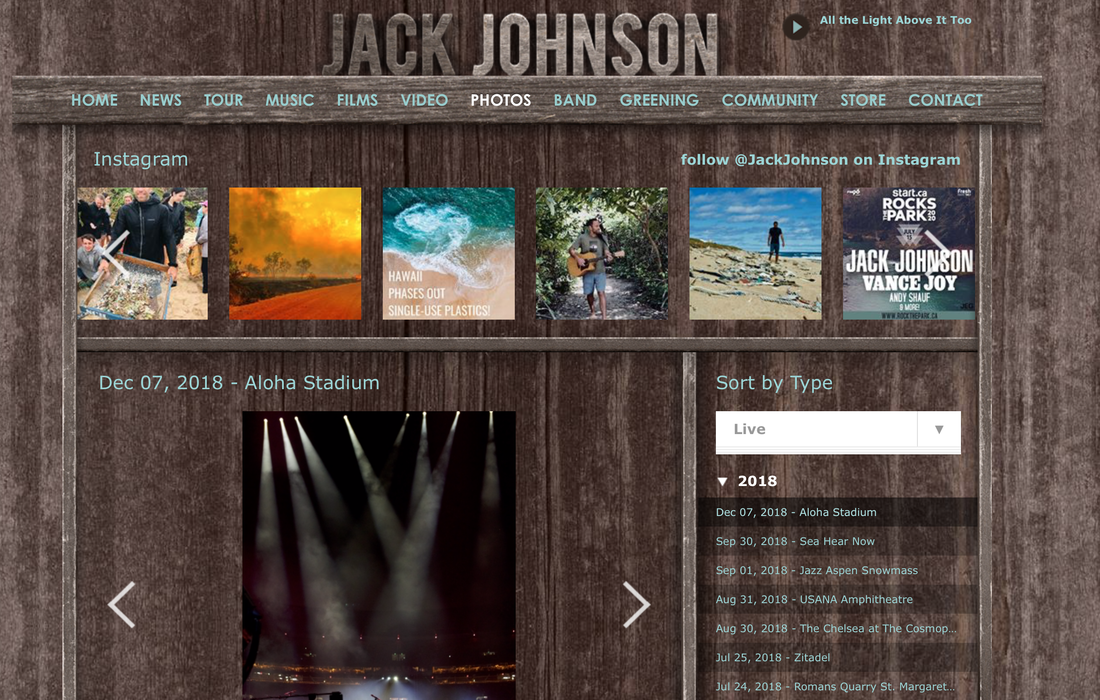
This is Jack Johnston website, this is very different to The Lumineers website as this one looks very homemade as looks as though it was put together together by him for example. This website doesn't look very professional. Although it doesn't look professional it fits the theme of his music very natural and homemade. The background of this website if a dark wood look, this gives the website the homemade look at its natural look, the wood colour is masculine, I think this is he wanted to represent his music, natural and masculine. His name it put in big bold wooden letter at the top of page "Jack" is puts in this dark colour and "Johnston" light grey colour this is a nice contrast between the two colour the light and dark, there is then a wooden strip underneath the title on this wooden strip, with have the different parts to the website in light blue non serif I felt this looked quite unprofessional, when you press on the blue text it highlights white. `underneath he states his social medias his Instagram, then a few photos from his instagram he's wrote his instagram in blue. He has then put a few photo from his instagram underneath .He then has a see of his photos which you are able to sort though at the side of his page.
|
|
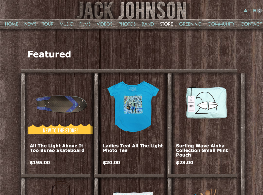
This is another feature on his website his store this Is where you are able to buy offical merchandise, He has a thick white featured sign underneath are a few different items
|
Planning
|
|
|
|
jackjohnsondouremember.weebly.com
